I travelled a couple of times recently on Cross Country trains, and was reminded of some apparent UX fails in the design of their train carriages.
I shouldn’t single out Cross Country for blame on this, as I think these particular carriages made their debut in the early 2000s as Virgin trains.
They have some nice touches that the train I catch down to London is missing – window blinds, coat hooks and personal lights.
But there’s three things I noticed that just don’t seem to have been thought through from the point of view of the user – in this case the passenger.
Electronic display of seat reservations
Unlike paper reservation tickets stuck onto each seat, if you’re travelling without a reservation, and you’re trying to figure out where there’s unreserved seats, you can’t do this easily from the platform.
Even when you’ve boarded the train you have to wait at each row while the seat reservations scroll across the tiny screen. Plus you’d have to be pretty tall for this to be anywhere near eye-level.
Okay, so the electronic display probably saves time and money for the train operator, but I think this is at the expense of the user experience. With a paper reservation slips in each seat, you could see at a glance where unreserved seats where.
And what happens when the electronic system fails? Musical chairs as everyone grabs a free seat, until the passenger with the reservation ticket comes along.
The ceiling
The ceiling of the carriage isn’t a straightforward concave curve. Instead the ceiling includes a convex curve. Presumably this is aesthetically pleasing.

However it also means that the luggage space above the seats is smaller, and passengers can’t fit as much in. This seems like style over substance.
Open Sesame
The button to open and close the door between the carriage and the ‘vestibule’ is ON the door. When you approach the closed door this seems fine, as the button is right in front of you.
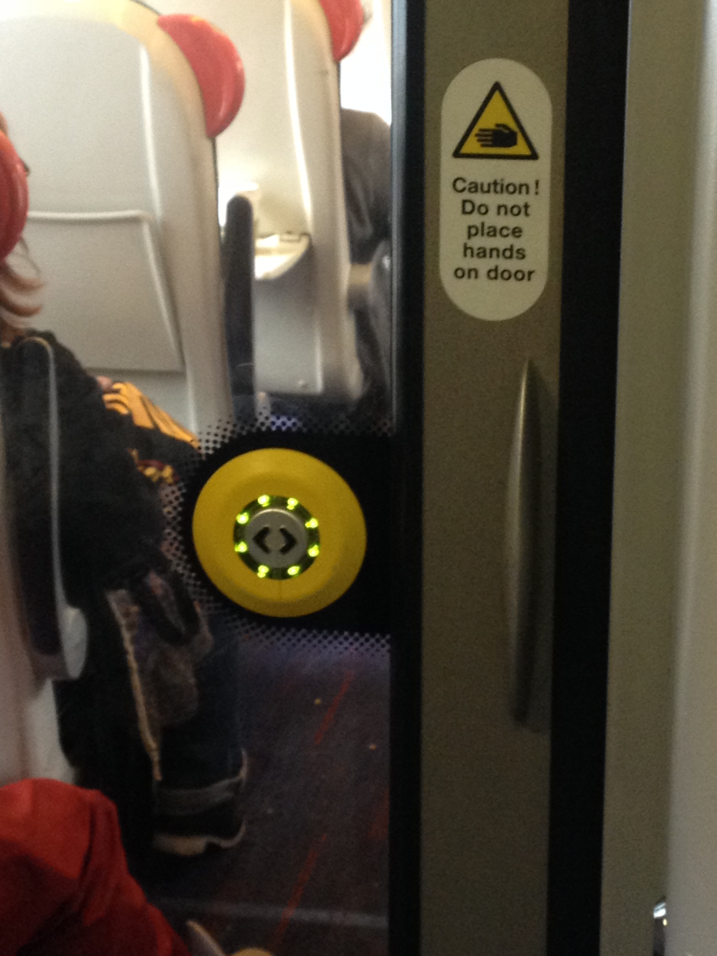
But when the open door starts to close, you’re trying to hit a moving target. Many times I’ve seen people queuing to get into a carriage (because those in front of them are peering at the electronic displays, or trying to cram their luggage into the undersized overhead luggage space) getting squashed by the doors because they can’t figure out where the button is.
Even R2D2 might’ve struggled to stop the garbage compacter if the inch-wide UI to do so had been a moving target…
This seems poor as you’re making your user interface, to operate something as fundamental as a door, inconsistent. Plus it’s really not great for people with poor motor skills.
To top it all off, the door-mounted button is accompanied by a sign warning you not to place your hands on the door.
I just thought of another one, which others have written about too…
Electronic toilet doors
So you press a button to open the toilet door, you enter and press a button to close it, then you have to press another button to ensure its locked.
What a faff. I mean, it’s a door, why does it need to be this complicated? Sure, there are instruction in the loo to ensure you lock it before dropping your trousers, but should you need instructions to operate a door?
What happens when the LED for the locked indicator fails. How can you be confident the door is locked?
What happens when the power fails? Do all the toilet doors just open, revealing some poor passengers mid-poo? Or do they all just lock, leaving them stuck in a stinky toilet all the way to Aberdeen?
A friend walked in on a guy in one of those toilets once, although she suspected from the grin on his face that he’d deliberately left it unlocked… urgh.
Usability Testing?
I’d be really interested in what kind of usability testing was done on these types of train carriage when they were designed.
Maybe this comes across as a bit of a rant, but it seems that the basic user experience for passengers aboard these trains could’ve been improved by a few simple changes.
Image Credit
“Class 390 Interior” by Sunil060902 – Own work. Licensed under CC BY-SA 3.0 via Wikimedia Commons.
