Impact Mapping is a technique for deriving scope from goals. It’s useful for looking at different options for meeting a particular measurable goal.
I’d been keen to try it out since picking up a copy of Gojko’s book on the subject at BDDX2012. I don’t think we’ve used it ‘end-to-end’ yet – to truly evaluate and measure different options – but I have found it really useful in deriving scope and ensuring that scope maps back to an original goal.
A good example of where we used Impact Mapping to derive User Stories on a very technical project was the ODS migration project. Due to the restructure of the NHS – removal of SHAs and PCTs, and introduction of CCGs and ATs – we had to do some work in order to reflect this structure to the public.
This involved extensive changes to multiple ETL packages, and changes to the code to generate organisation profiles. We could easily have dived straight in to the technical detail and decided which ETL packages to change.
Instead we went through an exercise to ensure that all of the technical work we were to undertake was mapped right back to the overall goal.
1. Goal
Firstly we established the overall goal that we’re working towards. In this case the goal is for the nhs.uk site to accurately reflect the new NHS organisation structure.
Normally with this technique we’d want the goal to be measurable – like an increase in profit of 5%, or an increase of 10000 subscribers. In this case the goal is effectively binary – either the site does reflect the new structure, or it doesn’t…
This is the cell at the centre of the map.
* In hindsight maybe we could have been more rigorous with the goal and measured it by surveying site visitors as to their understanding of the new structures. This may have been a better measure of the true overall goal – which is to communicate the new structure.
2. Actors
Next we went through an exercise of mapping out the different users, or actors associated with the goal of reflecting the new NHS structure, for example –
- The external organisations who provide data feeds into nhs.uk – ODS, PPD, EDOS, PCIS
- Organisation profile content managers
- The general public themselves, as they are going to view the new organisation profiles on the site.
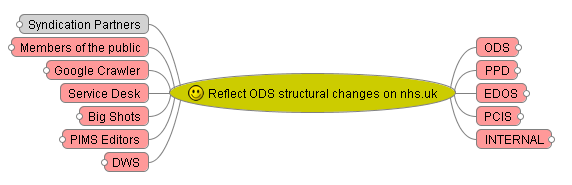
The actors are represented by the pink cells surrounding the goal. ‘Big Shots’ is a role that my colleague Ashish came up with – the senior stakeholders who use the accountability views in our ‘Find & Compare’ product.
In future I’d like to identify more specific roles, and possibly tie them in with the personas that our UX team use.
3. Impacts
After identifying these different roles, we looked at the different ways in which they contribute to reflecting the new NHS structure, or how their behaviour will change as a result of the new structures. What are the impacts we want to have on the actors, or the impacts that we need the actors to make.
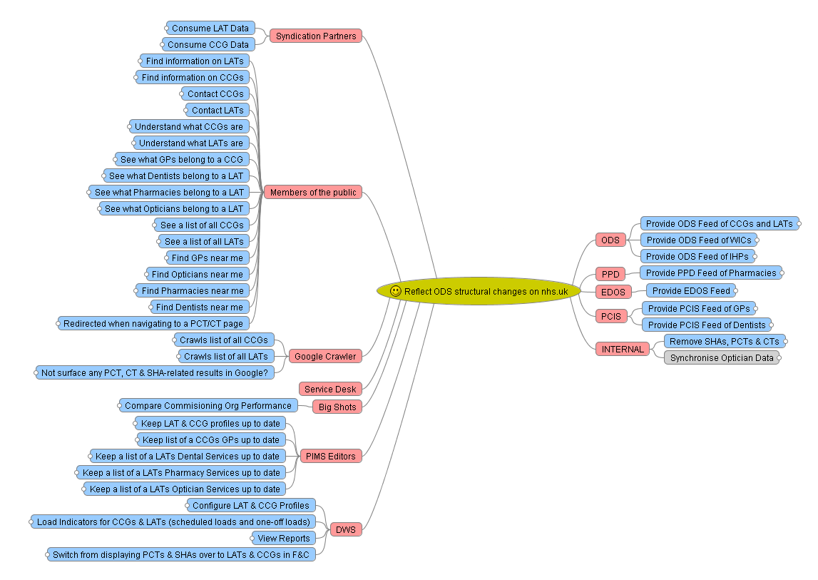
The blue cells represent the impact. The map really starts to expand at this point as some roles can do many things to bring us towards our goal.
4. Scope
Once we’d identified all of these behaviours we could then start to derive the scope required to enable that behaviour to occur.
So for example – ODS provide a nightly feed of the new NHS organisations, this is how they contribute to our goal of reflecting the new NHS structure. The work we need to do to enable that is to create a series of nightly import and data-synchronisation processes.
These can be derived as a series of user stories – something like
In order that nhs.uk can reflect the new NHS organisational structure
ODS can provide a nightly feed of CCG data
Each story is represented by a green cell. The overall map looks like this –

Some of these stories were high-level and were then broken down further – we just added another level of nesting of green cells to represent this break-down.
Visualising the backlog
I’ve found the map a really useful alternative way of presenting the product backlog for a particular project or piece of work.
Since we started using User Stories to represent requirements, some have commented that in doing so we lose sight of the bigger picture.
One thing a colleague mentioned the other day is that User Stories are like leaves on a tree, but when we put them into the backlog it’s like stuffing all the leaves into a bin bag – making it pretty difficult to maintain any context between them.
Now with our Impact Map we’ve re-formed the tree with the leaves in place. We can stick our map up on the wall, and cross items off as they’re completed, or make notes against them.
Living Document
We had a good stab at capturing the necessary scope up-front, but naturally things emerged as we progressed with the work. Having this Impact Map meant that we could always check where suggested scope fitted into the big picture – how did it help us get towards our goal.
“Does it help us meet the goal?”
Some technical work was suggested around changing the mechanism by which we import certain data feeds, but when we examined it in the context of the map, it turned out we didn’t really need to do it. If we had jumped straight into the technical work without looking at the users, their needs and impacts, we would have wasted time doing this unnecessary work.
Tracking
I was acting as BA on this project, and I personally found the map a really useful way of tracking scope, progress towards our goal, and what our priorities were. The map itself was useful during planning, prioritisation and design sessions, as we had a visual representation of the scope in front of us.
Each green ‘scope’ cell was set up to link to our work tracking system, and it was easy to visually represent progress on the map by ticking off or shading the completed stories. This showed how much closer we were getting to our overall goal.
The map was also used to show up blockers and dependencies in scope. We used icons in Freemind to indicate key questions and blockers that arose during delivery.
Tools
For the map described in this post I used FreeMind. Once you have a few keyboard short-cuts set up it’s quick to colour-code the cells and add icons and hyperlinks in.
I also tried out a MindMup version too.
Next steps…
The big thing I felt was missing from this first attempt at Impact Mapping was making the goal measurable. When I first created the map I didn’t think there was much in the way of metrics that we could use to measure our progress towards the goal – there’s certainly not a monetary value from our point of view. We could look at measuring the amount of traffic that certain areas of the site receive before and after implementation, and we could measure the number of service desk calls we receive in relation to the NHS structural changes.
This is something we need to work on – tying the features we deliver back to explicit, measurable goals. I think it really helps the whole delivery team understand what we’re aiming for, and if we can keep our options open for meeting that goal, and measure our progress towards it, then all the better.
We’ll keep refining our use of this technique on further product developments. We’ll push to get the Impact Map created as early on as possible, when we’re still figuring out the overall goal.
